Product Mockup Design for Ecommerce: How Brands Get Pro Photos Without the Price Tag

Why Product Visuals Make or Break Ecommerce Brands
Here's the blunt truth: online, your photos are your brand. A shopper scrolling through search results or their Instagram feed makes a snap judgment in under a second. Sharp, consistent, professional-looking images say "this brand has it together." Blurry photos, mismatched lighting, or a messy grab-bag of styles say the opposite, even if the product itself is great. And here's the part that stings a little: customers don't consciously think "this looks unprofessional, I won't buy." They just... scroll past. No complaint, no feedback, nothing for you to fix. You simply don't get the click. So how do you get sharp, consistent, polished images across your whole catalog without a studio budget? That's exactly what mockup design solves. Let's break down what it actually is.
What Is a Product Mockup? (And Why Does It Work So Well?)
Quick answer: A product mockup is a digital template that takes your artwork, label, or branding and places it onto a realistic 3D or 2D product scene — lighting, shadows, perspective, and environment all handled for you. You supply the design file. The mockup handles the rest.
The result looks like a photograph, because in most cases, the base scene actually was photographed with real product, real lighting, real shadows. Your design gets mapped onto it with pixel-perfect accuracy.
Why does this work so well? One word: context.
Picture a flat label on a plain white background. It tells the shopper almost nothing. Now picture that same label wrapped around a frosted amber bottle, sitting on a marble countertop in soft natural light. Suddenly it answers the question every online shopper is silently asking: "what would this actually look like in my home, on my desk, in my bathroom?"
That's the whole job of a mockup — not just to look pretty, but to answer that question before the customer has to ask it. Pro tip: A mockup is only as convincing as its lighting match. If the shadows on your label don't quite match the shadows on the product, your brain clocks it as "off," even if you can't say why. This is the single detail that separates a mockup that looks slightly fake from one that's indistinguishable from a studio shot — more on this in the mistakes section below, so don't let it trip you up later.
Which Product Categories Get the Biggest Win From Mockups?
Not every product category benefits equally from mockups, but the list is longer than most people expect. Here's where mockups consistently deliver the biggest upgrade, with real before-and-after examples for each.
Which Product Categories Get the Biggest Win From Mockups?
Not all product categories benefit equally, but the range is wider than most sellers expect.
Tech Accessory Mockups (Cables, Cases, Chargers, Earbuds)
Tech accessories live in one of the most crowded corners of ecommerce. Cables and chargers especially — scroll any search results page and you'll see dozens of nearly identical products. The only thing separating you from the competition is how premium your listing looks. Here's the thing: a single product-on-white photo barely scratches the surface. What actually moves the needle is a full composite image — your product render, plus lifestyle context, plus feature callouts, all in one frame.
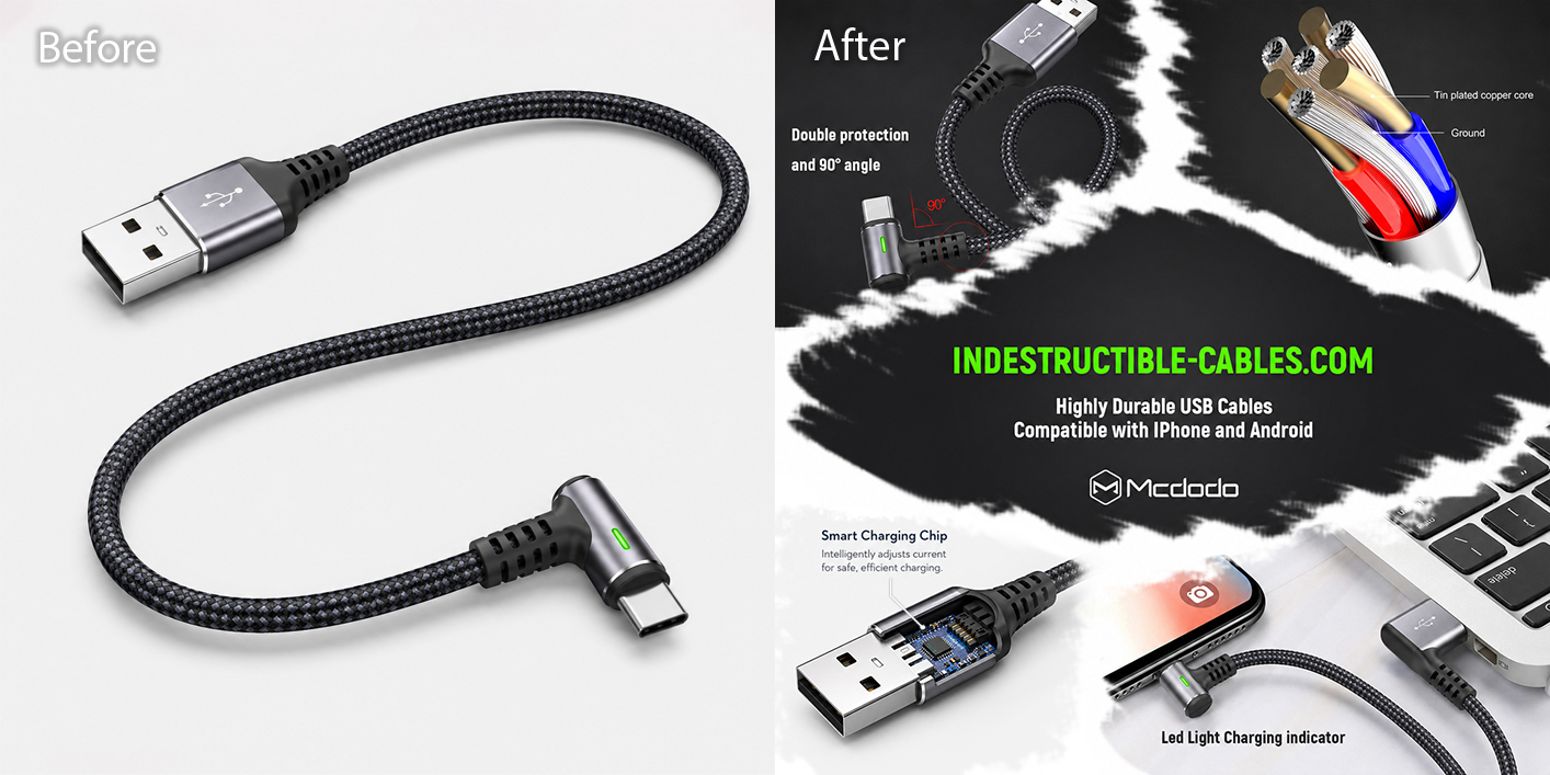
Before: a clean standalone product shot. After: a complete marketing composite - a lifestyle shot, a technical cutaway, and callouts for the 90° connector, LED charging indicator, and device compatibility, all in one image.
Notice how the light background acts as breathing room between each element. Your eye lands on one detail at a time instead of feeling overwhelmed.
Don't let this trip you up: cramming in every feature you can think of backfires. Pick the three or four things that actually differentiate your product — the 90° angle, the reinforced cable, the LED indicator — and let the mockup do the rest.
Home Goods & Candle Mockups
A candle on a plain white background says "here is a candle." A candle on a warm neutral surface, with soft natural light falling across it, sitting next to its branded gift box? That says "here is a candle that's going to make your living room smell amazing — and look this good doing it."
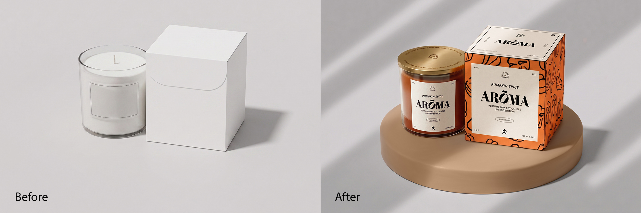
Before: a plain glass candle and a blank white box. After: the finished "Pumpkin Spice Arōma" candle and box, styled together on a warm neutral surface with soft directional light — no extra props needed.
This is label-forward styling at its best. The glass vessel and the gift box are shown together, with nothing else competing for attention. The label design and the product do all the talking.
Good news for anyone managing a big catalog: once you've built one or two solid "scene" templates like this, you can drop in new designs — different scents, different seasons, different SKUs — and keep that same polished look across your whole range. No new photoshoot for every new candle.
Apparel & Print-on-Demand Mockups
Want to show off a whole clothing or accessory line without booking a single model? Mockups are basically made for this. Flat-lays, ghost mannequins, hanging racks, folded stacks on a shelf — pick a "look" and apply it across your entire collection for instant visual consistency. Add a few props and some color styling, and a plain product suddenly looks like it belongs in a catalog shoot.
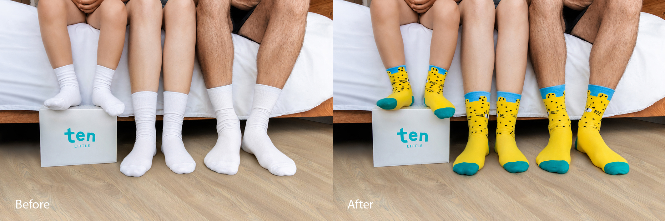
Before: a real photo of plain white socks on real feet. After: the exact same photo — same folds, same texture, same shadows — now showing a completely different leopard-print design that bends with every crease.
Here's where it gets really useful, especially for print-on-demand sellers: that's a real photo. Same shadows, same folds, same everything. Only the design changed — and it sits like it was knitted that way from the start. New design. Real photo. Zero reshoot. That's the print-on-demand dream: shoot one solid "base" photo of a blank product, then swap in design after design without ever picking up a camera again.
Food Packaging Mockups
Food packaging mockups have one extra job that other categories don't: appetite appeal. That's the (very real) skill of making something look genuinely delicious through visuals alone, before a customer reads a single ingredient. The right scene does a lot of this work for you. Rustic wood, clean white marble, or a styled grocery shelf can make even a simple packaging design feel like a premium retail product.
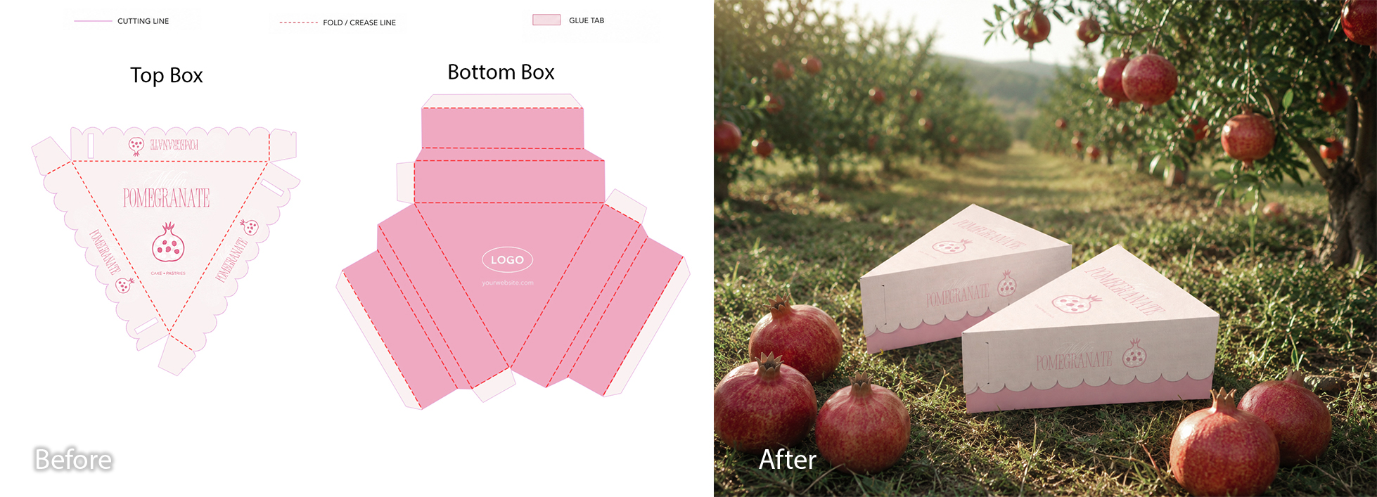
Before: the flat dieline — the cutting and folding template for the box. After: the finished 3D box, wrapped perfectly and placed in a sunlit pomegranate orchard, surrounded by real fruit.
This pomegranate pastry box shows how far a mockup can go — taking a flat dieline (that's the cutting and folding template on the left) and turning it into a believable 3D box, dropped into a setting that tells you exactly what flavor to expect.
Color matters more here than people realize. Warm reds, oranges, and golds don't just look nice — they signal flavor before anyone reads the label. Pair that with an "achievable" setting (a kitchen counter, an orchard, a market stall) and your packaging stops looking exotic, and starts looking like something a customer could be enjoying tonight.
Beverage & Bottle Label Mockups
Beverages are unforgiving. A single bottle on a clean background has nowhere to hide — your brand colors need to be exactly right, and your label needs to look genuinely *printed onto the bottle*, not pasted on top like a sticker.
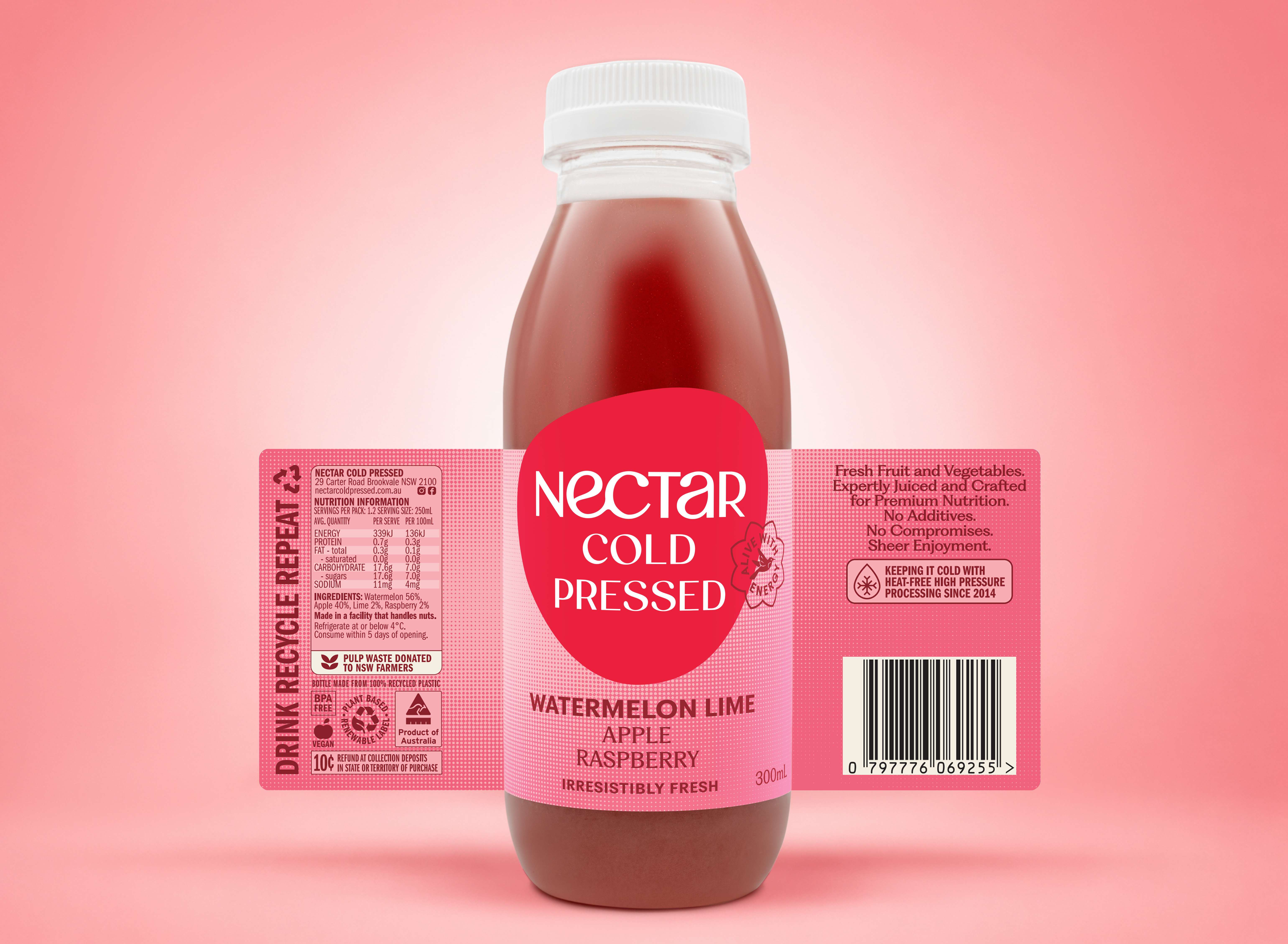
A Nectar Cold Pressed bottle with the label fitted to follow the curve of the glass, lined up precisely to the real label edges, with highlights and reflections matched to the bottle's actual lighting.
This is where good mockup work really shows. The label here wasn't just placed on top of the bottle — it was fitted to follow every curve, lined up to the exact edges, with the highlights and reflections matched to the bottle's real lighting. The result reads as a studio photo, not a label slapped over a stock image.
Here's a genuinely useful trick if you're waiting on packaging from a printer: photograph your bare bottle now, and add the label via mockup the moment your artwork is approved. You're not stuck waiting for printed, foiled labels to arrive from your supplier before your marketing can go live. Your images can be ready before your product is.
Supplement Bottle Mockups
Supplements run on trust, full stop. Nobody puts something in their body unless the brand already feels credible, which is exactly why so many supplement brands default to a clean, almost clinical look. But "clinical" doesn't have to mean cold or boring. The real trick is matching the mood of the scene to what the product actually does.
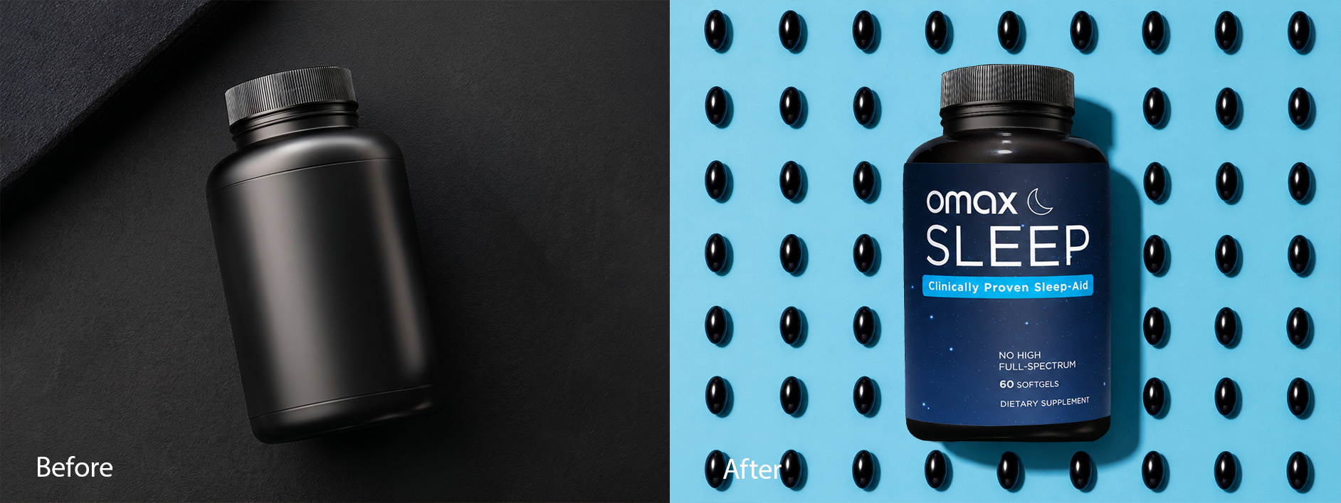
Before: a plain dark bottle on a dark background — it could be any supplement. After: the finished "Omax Sleep" bottle, centered on a cool blue background scattered with softgels arranged like stars in a night sky.
Look at that transformation. The "before" is fine, but it could be literally any supplement on the shelf. The "after" tells you what it is and what it does before you've read a word — softgels scattered across a midnight-blue background, the dark bottle floating dead center. "Clinically Proven Sleep-Aid" just confirms what the visual already told you.
A morning multivitamin would flip this entirely — bright, energetic, sunlit. The mood of the scene should match the job the product does. That's the real trick: the scene sells the benefit before the label does any explaining.
CPG & Multi-SKU Product Line Mockups
If you're managing a whole range of products with different sizes, flavors, or seasonal editions, mockups stop being a "nice extra" and become a production system.
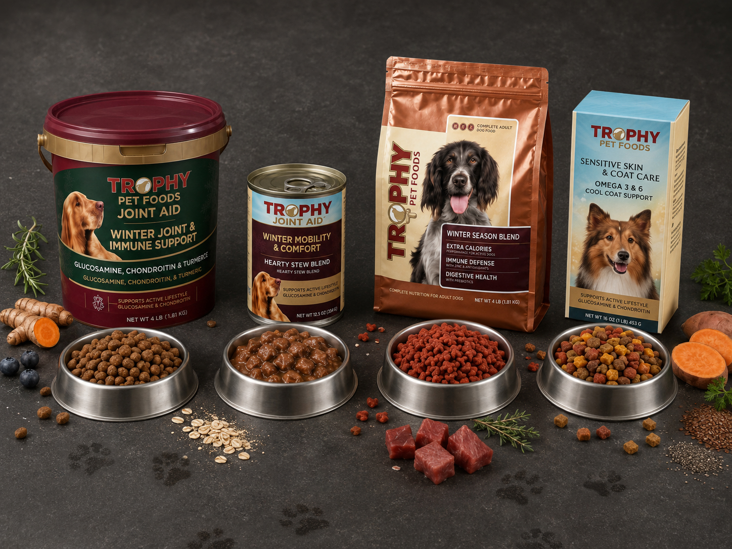
A full Trophy Pet Foods "Winter Season" range — tub, can, bag, and box — shown together with bowls of the actual food and seasonal ingredients (turmeric, sweet potato, blueberries) tying the whole line together.
This example shows what consistency at scale looks like: four different products, four different formats, but the same lighting, the same background, the same overall feel. The whole range looks like one cohesive brand, not four products that happen to share a logo.
You may also want to check: if you're running a multi-SKU brand, it's worth building a "mockup scene library" - a small set of go-to backgrounds and layouts you reuse for every new product, so you're never starting from scratch.
How to Use Mockups Strategically (Not Just as a Workaround)
Here's the mindset shift that separates brands that get real value from mockups, versus brands that just use them as a "we can't afford photography" stopgap: treat mockups as a production system, not a one-off fix.
In practice, that looks like three things.
Build a content library, not a one-off image. Don't create a mockup, use it once, and move on. Build a small library of "scenes" — a few backgrounds, a few angles, a few lifestyle settings — once, and reuse them for every new product, season, or campaign. Your "monthly photoshoot" problem just... disappears.
Test before you commit. Thinking about a darker label versus a lighter one? Don't guess, and definitely don't print thousands of units to find out. Mock up both versions, run them as ad creatives or product images, and let the data tell you which one converts better. Visual A/B testing goes from "expensive and slow" to basically free.
Launch on day one, not week six. New SKU, new flavor, new colorway — the moment your design file is approved, your mockup images can be ready. No waiting on a photographer's calendar, a studio booking, or a sample shipment. That's a real competitive edge when you're racing a trend or a launch date.
Can You Use Product Mockups for Amazon Listings?
Short answer: yes — and mockups might actually be better suited to Amazon than almost anywhere else. Here's why: Amazon's main image requirements are notoriously strict. Here's what your main image needs to follow:
- A pure white background — and Amazon means pure: RGB 255, 255, 255, not off-white or light grey
- Your product filling at least 85% of the frame
- A minimum of 1,000px on the longest side to enable zoom, with 1,600px or more recommended
- No extra text, logos, watermarks, or graphic overlays
- No props or accessories that aren't actually included with the product
- A well-built mockup checks every one of these boxes by default.
- No lightbox, no arguing with a photographer about file specs, no reshoot because the lighting was 2% off.
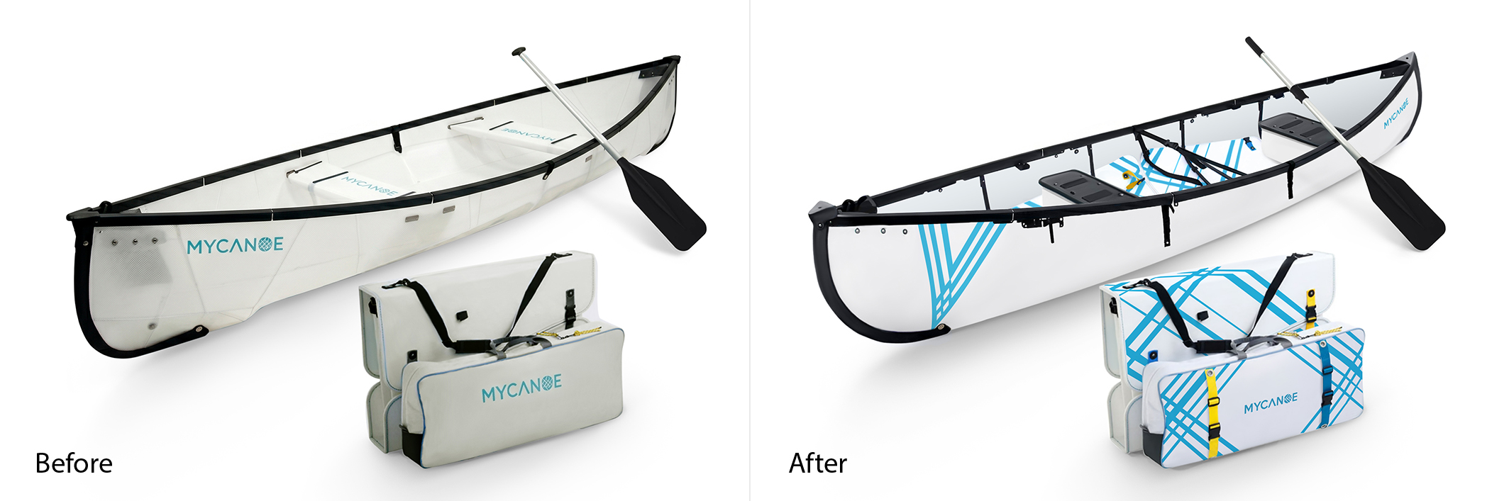
Before: the original "Solo" canoe, already photographed on white. After: a "Duo" version with updated artwork applied via mockup, built before the new product had even shipped.
This MyCanoe example shows exactly that. The "Solo" canoe was already photographed on white, but the brand needed a "Duo" version with new artwork, before the new product had even been manufactured. The mockup let them build a fully compliant main image — clean white background, product filling the frame, crisp at full zoom — using the existing photo as the base. Sales momentum, zero gap.
Secondary Images: Your Real Storytelling Real Estate
Here's the catch most sellers miss: your main image has to be plain and product-only, but your secondary image slots don't. This is where lifestyle shots, feature callouts, size comparisons, and infographic-style overlays belong, and it's exactly where mockups earn their keep.
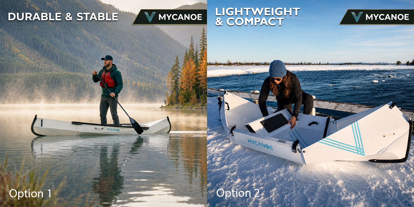
Two secondary-slot images for the same MyCanoe listing: "Durable & Stable" (in use on the water) and "Lightweight & Compact" (folded for transport) — same brand colors, same typography, different selling points.
These two images are a great example of secondary-slot content done right. Same brand, same visual style, but each one is built to highlight a different reason to buy — exactly the storytelling that white-background-only listings are missing.
A Quick Word on AI-Generated Images (Because This Matters Right Now)
You may have seen headlines about Amazon cracking down on AI-generated product images. Here's the short version: Amazon's current policy draws a line between minor AI-assisted edits — background removal, color correction, lighting adjustments — and substantial AI generation, where entirely new visual elements appear that were never actually photographed. Here's why that doesn't put mockups at risk: a proper mockup isn't generating anything. You're taking your real design file and compositing it onto a real, photographed product scene using the same layering and retouching designers have used for decades, long before "AI" entered the conversation. The core rule, either way, is the one we've already covered: the image has to accurately reflect the actual product the customer receives. A well-made mockup, by definition, already does that.
Don't let this trip you up: the risk isn't mockups. It's using generative tools to invent product details, backgrounds, or features that don't exist. That's the kind of content that gets listings flagged and it's bad practice on any platform, not just Amazon.
One more nuance worth knowing: Amazon requires that your main image accurately represents the product. You can't use a mockup to misrepresent color, size, or what's included in the box. Used honestly, a mockup is completely indistinguishable from a studio shot, to both Amazon's systems and to shoppers. Platform policies like this one move fast, so it's always worth a quick check of Amazon's current Seller Central image guidelines before a big launch.
Common Product Mockup Mistakes to Avoid
Mockups are powerful, but they're not magic — a poorly executed one can look *worse* than no extra image at all. Here's what to watch for.
Mismatched lighting and shadows. If your label's shadows don't match the product's shadows, it reads as "pasted on," even to someone who couldn't tell you why. This is the number-one giveaway of a low-quality mockup. Not even close to convincing, honestly.
The wrong mood for the product. A cold, clinical scene for a cozy product (or a bright, energetic scene for a calming one) sends a mixed message before anyone reads a word. Match the scene's mood to what your product actually feels like or does.
Inconsistent scenes across your catalog. If every product photo uses a totally different background, lighting style, and angle, your store looks disjointed — like ten brands stitched together. Pick a small set of "house styles" and stick to them.
Treating your main Amazon image like a secondary slot (or vice versa). Don't put lifestyle graphics, text overlays, or callouts on your main image — these can get a listing flagged. Save that storytelling for your secondary slots, where it belongs.
A mockup that doesn't match the real product. This one matters most on Amazon, but it's good practice everywhere: if your mockup shows a feature, color, or size your actual product doesn't have, you're setting up returns, bad reviews, and — on Amazon — a policy violation. Keep mockups accurate, even when they're polished.
DIY or Outsource? When to Bring in a Mockup Design Pro
If you're comfortable in Canva, Photoshop, or a dedicated mockup tool like Placeit and Smartmockups are popular starting points and you can absolutely create solid mockups yourself, especially for simpler categories like apparel flat-lays or single-product shots on plain backgrounds. But here's where DIY starts to cost you more than it saves:
- You're managing dozens of SKUs and need every image to match perfectly
- You need complex composites — lifestyle shot, cutaway, and callouts, like the cable example above
- Your label needs to wrap precisely around a curved or unusual product shape
- You're prepping for an Amazon launch and can't afford a rejected image or a missed deadline
- You'd genuinely rather spend that time on literally anything else in your business
Good news: this is exactly the gap mockup design services exist to fill. Instead of wrestling with templates and wondering why your label doesn't quite sit right at the edges, you hand over your design files and get back images that are ready to publish, often paired with retouching (color correction, background cleanup, shadow work) that takes a "good" mockup to a "this looks like a six-figure brand" mockup.
At BeautyRetouching.net, this is what we do all day — high-quality product mockups and retouching for ecommerce brands, from single product launches to full multi-SKU catalogs like the Trophy Pet Foods example above. If your visuals feel like they're holding your brand back, get in touch and let's talk about what's possible for yours.
FAQ: Product Mockup Design for Ecommerce
What is a product mockup?
A digital template that places your design, label, or artwork onto a realistic photo or 3D scene of a product, so it looks like a finished, photographed item without an actual photoshoot.
Do product mockups look fake?
Not when they're done well. The giveaway is mismatched lighting and shadows — a well-made mockup matches your label's lighting to the product's real lighting, making it indistinguishable from a photograph.
Are mockups allowed on Amazon?
Yes. As long as the image accurately represents what the customer will receive (correct color, size, contents) and meets Amazon's standard image requirements: a pure white background and no extra graphics for the main image, with more creative freedom in secondary slots.
Will Amazon flag my mockup as "AI-generated"?
No, not if it's a genuine mockup. The policy targets images where AI has generated new visual content that wasn't really there. A mockup composites your real design onto a real photographed product, which is standard retouching, not AI generation.
Can mockups replace my product photography entirely?
For most ecommerce brands, yes, especially for packaging-led products like candles, bottles, boxes, and apparel. Some categories — food that needs to show real texture, or products where scale is hard to convey — may still benefit from occasional real photography, but mockups can cover the bulk of your image needs.
How do I get started with mockups for my brand?
Start small: pick your best-selling product, find or build one solid mockup scene that fits your brand, and apply it consistently. Once that's working, expand your "scene library," or hand the whole thing to a mockup design service if your catalog is bigger than your bandwidth.
Quick Recap: Is Mockup Design Right for Your Brand?
If you're skimming (no judgment, that's exactly what this section is for):
- Mockups place your design onto a realistic product scene, no camera needed
- They work especially well for tech, home goods, apparel, food, beverages, supplements, and multi-SKU CPG brands
- Used strategically, they're a content production system, not just a budget workaround
- They're Amazon-compliant when your main image follows the white-background rules and accurately represents the product
- The most common mistakes come down to mismatched lighting, inconsistent styling, and mockups that don't match the real product
Ready to see what mockup design could do for your product line? Get in touch with our team and we'll show you exactly how it would look, using your own designs, no pressure.