Amazon Listing Image Optimization: The Complete Guide for Sellers

Why Your Amazon Images Are Your Most Important Asset (Not Your Keywords)
Here's something most new Amazon sellers get backwards. They spend hours optimising keywords, writing bullet points, and chasing reviews while uploading whatever photo the manufacturer sent them.
Here's the catch: before a shopper reads your title, checks your price, or counts your reviews, they've already decided whether to click. That decision happens in under a second. And it's made entirely on your main image.
This matters more than most sellers realise, because Amazon's algorithm responds to click-through rate. More clicks lead to more sales velocity, which leads to higher organic ranking. Every pound or dollar you spend on Amazon PPC is either amplified or wasted depending on whether your main image earns that click first.
Think of your full image stack as a silent sales team running 24/7:
- Your main image earns the click
- Secondary images build desire
- Infographics handle objections
- Lifestyle shots make buyers picture themselves using it
- A+ Content closes the deal
Each image has a specific job. Skip any one of them, and you're handing conversions to a competitor whose product may not even be better than yours.
Quick answer: If you can only fix one thing this week, fix your main image. It's the single highest-leverage change you can make to your listing — and it has strict rules you need to know before you touch it.
Amazon Main Image Requirements: Compliance Comes First
Good news: Amazon's main image rules are clear and consistent. The tricky part is how precisely you have to follow them because getting it wrong can get your listing suppressed, which means your ASIN disappears from search entirely. Here's what Amazon requires for your main product image:
- Pure white background — not "whitish," not light grey, not slightly blue-white. Exact RGB 255, 255, 255. That's #FFFFFF.
- Product filling at least 85% of the frame — your product needs to be large in the shot, not floating in a sea of empty space
- No text overlays, watermarks, or logos added on top of the image
- No props or accessories that aren't actually included in the box
- No borders, patterns, or coloured backgrounds of any kind
Violating any of these doesn't just earn you a warning. Amazon can suppress your listing completely until you fix it — and that can happen without notice. Compliance isn't just a creative issue. It's a business continuity one.
What Makes a Main Image Actually Win (Beyond Just Complying)
Compliance is the floor. Within those rules, your main image is a competitive sport. Here's what the top-performing Amazon main images consistently have:
- True white background — photographed on white still usually needs post-processing to hit RGB 255, 255, 255 exactly. Light grey and pure white look the same to your eye; they don't look the same to Amazon's systems.
A realistic shadow — a subtle drop or contact shadow added in editing. On mobile (where over 62% of Amazon browsing happens), a product with no shadow looks weightless and cheap. A correctly lit shadow anchors the product and signals quality — without touching the TOS. - Perfect edge masking — especially for hair, fur, fabric, glass, and transparent products. Rough or jagged edges are one of the fastest ways to communicate "low-quality brand" to a shopper.
- Accurate colour grading — your image needs to match the real product exactly. A colour that looks even slightly off is one of the top drivers of returns, which hurts both your metrics and your seller health.
3/4 angle — this shows the maximum amount of product shape and features in a single frame.
Readable label text — if your product has packaging, every word on it should be crisp and legible. Foil, embossed, or metallic effects should be preserved in editing, not flattened.
Clear at 160×160px — that's the thumbnail size on mobile search results. Zoom out on your image before you upload and check whether your product still reads cleanly at that size.
Here's the honest part: several of these — the shadow, the edge masking on complex textures and transparent materials, and the precise colour matching — are professional retouching skills, not quick fixes in basic editing software. Most manufacturer-supplied photos need significant post-processing work to reach this standard. Uploading them as-is and hoping for the best is one of the most common reasons Amazon listings underperform with no obvious explanation.
Pro tip: A well-executed shadow is one of the single biggest visual upgrades you can make to a product-on-white image. Done properly in Photoshop, it adds no compliance risk and makes a measurable difference to how real and premium the product looks on screen — and it's usually the first thing our retouchers address when a seller shares their current main image with us. The before-and-after is immediate and visible.
The Secondary Image Stack: 6 Images That Do 6 Different Jobs
Once your main image earns the click, your secondary images take over. Amazon gives you up to 9 image slots total. Most sellers either leave slots empty or fill them with extra white-background shots that add nothing. Don't let this trip you up — those slots are prime conversion real estate.
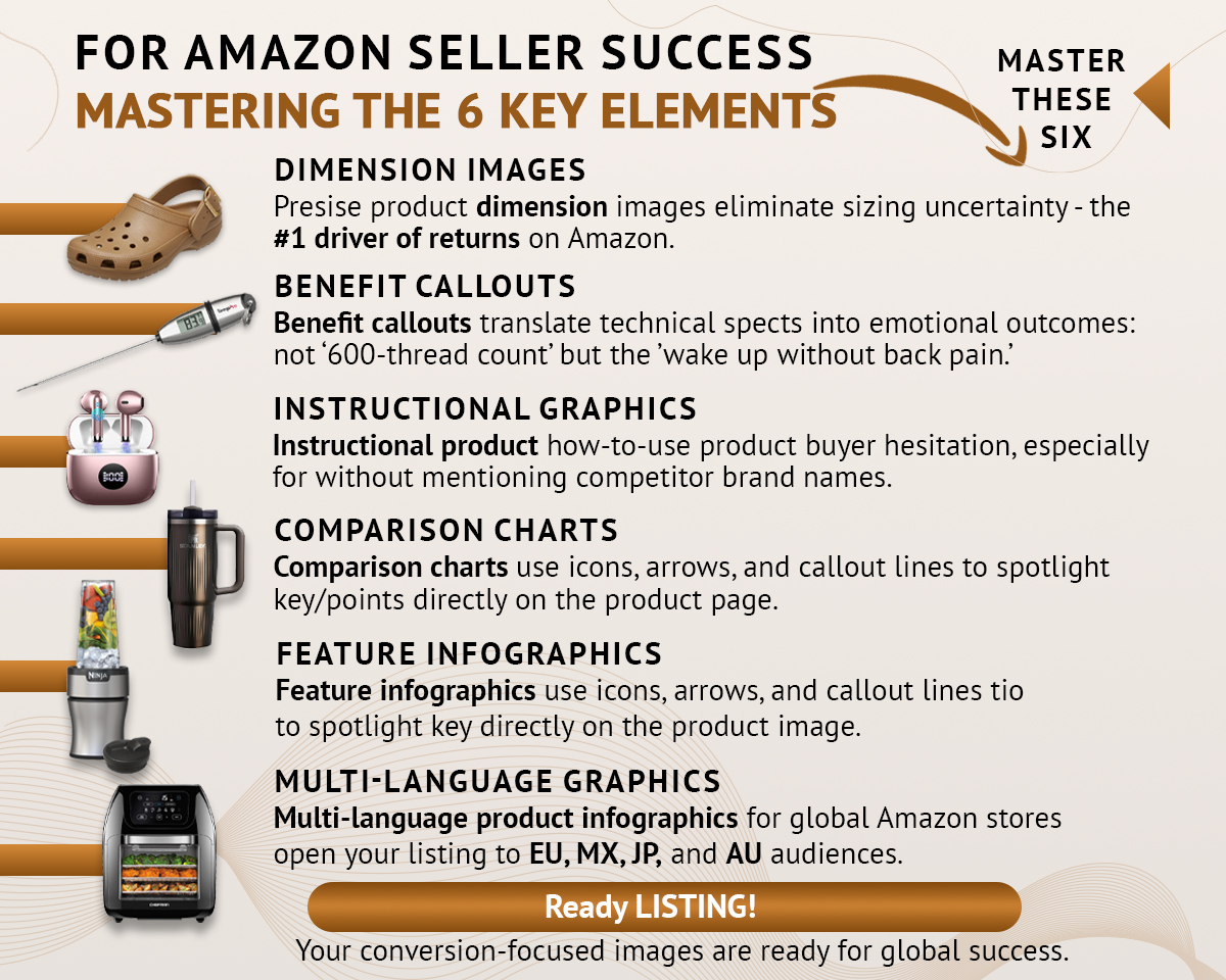
Six image types, six different jobs — together they cover every stage of a buyer's decision, from "will this fit?" to "is this better than the others?"
Here's what each type does and why it matters:
- Dimension images — sizing uncertainty is the #1 driver of returns on Amazon. A simple image showing exact measurements, a scale comparison with a familiar object, or a "fits in your palm" context shot handles this objection before the customer has to wonder about it.
- Benefit callouts — translate technical specs into outcomes real people care about. Not "600-thread count." "Wake up without back pain." Not "3,000mAh battery." "A full day of use on a single charge." The spec is proof; the benefit is the reason to buy.
- Instructional graphics — for any product with a setup process or learning curve, a simple how-to-use sequence dramatically reduces hesitation at the point of purchase. It also reduces post-purchase confusion, which is one of the biggest sources of negative reviews.
- Comparison charts — if your product genuinely outperforms alternatives on specific points, a side-by-side chart makes that visible at a glance. One important note: Amazon's TOS prohibits naming competitor brands directly. Compare against "standard" or "traditional" alternatives instead.
- Feature infographics — callout lines and icons pointing directly to features on your product photo. These work especially well for multi-function products, electronics, and anything where the design itself is a selling point.
- Multi-language graphics — if you sell on Amazon EU, MX, JP, or AU marketplaces, infographics in the local language lift conversion in those stores significantly. Not every seller needs this immediately, but if you're already selling globally, it's a high-value, relatively low-effort upgrade.
Pro tip: Every product has a primary objection — the one thing that makes a buyer pause right before deciding not to purchase. A supplement buyer worries about safety and effectiveness. A furniture buyer worries about fit and assembly. A clothing buyer worries about sizing. Identify yours and design your first secondary image around that specific hesitation. Then build the rest of the stack.
Lifestyle Images and Composite Shots: Make Them Picture It
Infographics inform. Lifestyle images inspire.
The best lifestyle shot answers a single question: "Can I picture myself using this?" It places the product in a context that feels aspirational but achievable — and it should match your actual buyer persona as closely as possible.
A candle in a lifestyle image isn't just sitting on a surface. It's burning on a marble countertop in a calm, beautiful home. A blender isn't just standing in a kitchen — it's mid-pour next to a fresh smoothie and a whole morning worth of energy. The product isn't the hero. The life the product enables is.
For sellers who can't justify a full studio shoot for every product, professional composites deliver virtually the same result. A skilled retoucher places your product into a licensed background image with matched perspective, blended lighting, and realistic shadows — results that are genuinely indistinguishable from a $5,000 location shoot. This is one of the most-requested services at BeautyRetouching.net, and it's easy to see why: premium lifestyle imagery at a fraction of the cost and timeline, with none of the scheduling headaches of a real shoot.
Pro tip: For smart home devices, electronics, or anything with visible installation or setup, consider a composite that combines lifestyle and infographic — product shown in a beautiful real-world setting, with callout lines pointing to specific features. You get the aspiration and the information in a single image slot.
A+ Content: Your Brand's Conversion Engine
Enrolled in Amazon Brand Registry? Then you have access to A+ Content — and if you're not using it yet, that's the quickest win available to you right now.
A+ Content replaces the standard plain-text product description with a fully designed, scrollable layout of custom images, brand story sections, comparison modules, and feature highlights. Amazon's own data puts the average conversion lift at 3–10%, with strong implementations regularly reaching 15–20% in competitive categories.
Here's what goes into A+ Content that actually converts:

The full A+ Content checklist on the left, and a real finished example on the right — showing exactly how each element translates into a live module.
- Brand story — creates emotional connection and builds trust before a buyer commits. This is where you answer "why does this brand exist and why should I trust it?"
- Hero banner — the first thing shoppers see when they scroll down to A+ Content. It needs to communicate your core benefit clearly and fast.
- Clear module structure — each module needs a headline, a benefit, and a visual. That three-part pattern guides the eye naturally and improves comprehension without extra effort from the reader.
- Instructional graphics — show exactly how the product works, step by step. These reduce purchase hesitation and reduce post-purchase confusion that leads to negative reviews.
- Comparison module — one of the most powerful A+ elements for cross-selling your own product range. Let shoppers choose between two or three of your products in a side-by-side format, so they pick the right one rather than leaving to find a competitor's alternative.
- Mobile-first design — A+ Content renders differently on mobile and desktop. Always design assuming the shopper is on a phone. Check the mobile preview before submitting every module, every time.
- Premium A+ features — if you qualify (usually requires Brand Registry in good standing with a sales history), Premium A+ unlocks interactive hotspot modules, video, and larger image formats. Higher engagement, longer time-on-page, better conversion.
Here's the catch: A+ Content that looks beautiful but has blurry images, loads slowly, or doesn't render cleanly on mobile can actually hurt your conversion rate. Get the technical basics right first — correct resolution, sRGB colour space, mobile-checked layouts before worrying about premium modules.
This is also where professional design tends to pay for itself most clearly. Building A+ Content correctly with right resolution for every module, mobile and desktop both checked, comparison charts that actually read on a phone screen — is time-consuming and fiddly to get right without the right tools. Done well, it's one of the highest-returning investments in your listing. Done badly, it actively costs you conversions.
Amazon Storefront: The Only Page on Amazon With No Competitor Ads
Every other page on Amazon is covered in sponsored listings, "customers also bought" widgets, and competitor carousels. Your storefront is the exception.
A well-designed Amazon storefront shows no competitor ads, no distracting widgets, and no off-brand recommendations. It's fully under your creative control — and that's genuinely rare real estate on a platform this competitive.
Beyond brand building, storefronts support higher average order values through collection-based navigation and product bundling. Private label sellers with a cohesive, well-designed storefront consistently report 25–40% higher repeat purchase rates compared to those without one.
Think of your storefront as a mini brand website inside Amazon — one where shoppers can browse your full range without ever seeing a reason to leave.
Amazon Image Technical Requirements: The Specs You Need to Get Right
Before you upload anything, every image file needs to meet Amazon's technical standards. Getting these wrong causes upload errors, image suppression, or zoom not working — all of which quietly cost you sales without giving you any obvious clue why.
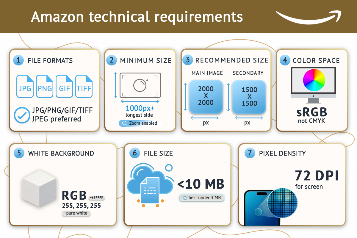
All seven technical requirements in one place — bookmark this before your next upload.
Here's the full checklist:
- File format: JPEG, PNG, GIF, or TIFF. JPEG is Amazon's preferred format and the safest choice in almost every situation.
- Minimum size: 1,000px on the longest side. Go below this and zoom won't work, which measurably hurts conversion on desktop. Don't let this trip you up — many manufacturer-supplied images fall below this threshold.
- Recommended sizes: - Main image: 2,000 × 2,000px - Secondary images: 1,500 × 1,500px
- Colour space: sRGB — not CMYK. This is one of the most common technical mistakes sellers make. CMYK is a print colour space; it makes colours look dull and slightly muddy on screen. Always convert to sRGB before uploading. It's a one-click change in most editing software.
- White background (main image only): RGB 255, 255, 255. Exact. No exceptions.
- File size: Under 10MB is required. Under 3MB is ideal for fast loading — which matters more on mobile connections, where most of your shoppers are.
- Pixel density: 72 DPI. This is a screen standard. Higher DPI (like 300 DPI from print-ready files) doesn't improve image quality on Amazon — it just increases file size unnecessarily.
Pro tip: the sRGB vs CMYK issue is easy to miss when working with designers or photographers who prepare files for print. Always specifically request sRGB files, or convert them yourself before uploading. Check this before every upload, not just the first time.
Amazon's technical requirements are updated from time to time — always worth a quick check of your Seller Central image guidelines before a major listing update or new product launch.
Where to Start: A Week-by-Week Action Plan
Knowing what to fix is one thing. Knowing what order to fix it in is where most sellers get stuck. Here's a prioritised roadmap:
- Week 1 — Fix your main image first
Audit it against the compliance checklist above. Professional retouching — true white background, realistic shadow, clean edge masking — is the one step we'd recommend outsourcing even if you handle everything else yourself. The precision required is genuinely difficult to achieve without professional tools, and your main image is where every other investment in your listing either pays off or doesn't. If you're eligible for Manage Your Experiments, set up a two-week split test comparing your current main image against the new version. Let the data decide. - Weeks 2–3 — Build your secondary image stack
At minimum, you need: one dimension image, one benefit callout, one feature infographic, and one lifestyle composite. These four image types account for the majority of secondary-image conversion impact. Professional infographic design makes a visible difference here — the right layout, callout hierarchy, and benefit language for your specific category is something a generic template rarely gets right. Everything else builds on this foundation. - Week 4 — Design and publish A+ Content
Use the comparison module for cross-selling within your own product range. Build a brand story section. Check every module on mobile before you submit. Allow a few days for Amazon's review and approval process before your launch date. - Ongoing — Storefront, global expansion, seasonal refreshes
Once your core listing is solid, build out your storefront with collection-based navigation, expand to multi-language infographics for global marketplaces, and schedule seasonal image refreshes for major shopping moments.
FAQ: Amazon Listing Images
Does image quality affect Amazon ranking?
Yes — indirectly but significantly. Amazon's algorithm responds to click-through rate and sales velocity. Better images get more clicks, which signals relevance to the algorithm and lifts organic ranking. It's one of the clearest and most direct ROI improvements available to any seller.
Can I use a lifestyle image as my Amazon main image?
No. Your main image must show only the product on a pure white background. Lifestyle environments, props, text overlays, and background scenes are reserved for secondary image slots 2 through 9.
What is the difference between A+ Content and EBC?
They're the same thing. Enhanced Brand Content (EBC) was the older name; Amazon rebranded it as A+ Content. Both refer to the enhanced product description layout available to Brand Registry sellers.
How many images should my Amazon listing have?
Use every available slot. Amazon allows up to 9 images including the main image. Listings that use all slots consistently outperform those that don't — empty slots are missed conversion opportunities.
Do I need professional editing for my Amazon images?
For your main image, yes. The precision required — exact white balance, realistic shadow, clean edge masking — is genuinely difficult to achieve without professional retouching tools and experience. For infographics and lifestyle composites, professional design makes a measurable and visible difference to both compliance and conversion rate. If you're looking for a team that specialises specifically in Amazon product image editing, BeautyRetouching.net handles all of it — main image retouching, secondary image infographics, lifestyle composites, and A+ Content design — all built to Amazon's exact specifications.
What happens if my Amazon images don't meet the technical requirements?
Minor issues may trigger an image quality alert in Seller Central. More serious violations can suppress your listing, which removes it from search results until the images are corrected — sometimes without any prior warning. Audit your images proactively rather than waiting for a suppression notice.
You may also want to check: our guide to product mockup design for ecommerce, which covers how to create Amazon-compliant main images using digital mockups — especially useful for new products before samples arrive or printed labels come back from your supplier.
Ready to Fix Your Amazon Images?
If your listing is live but underperforming, your images are the first place to look — not your keywords, not your price.
At BeautyRetouching.net, we handle Amazon listing image editing end-to-end: main image retouching, secondary image infographics, lifestyle composites, and A+ Content design — all built to Amazon's exact technical specs and optimised for mobile conversion.
Ready to see what better images would look like for your product? Get in touch and let's take a look together.